
A/R health at a glance
Total receivable, days in A/R, the share over ninety days and net collection rate — with what each one counts written on the card instead of buried in a data dictionary.
A/R health, denial patterns, payer behaviour, aging and cash trend, all drawn from the same claims data your team works in. When a dashboard and a drill-down disagree, people stop trusting both — so here they agree by construction.
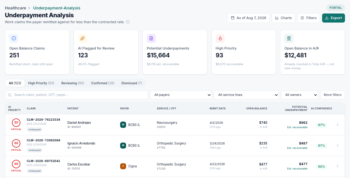
A revenue intelligence drill-down: claims flagged, dollars identified, and the per-claim detail behind the total, ready to filter, sort and export.
Total receivable, days in A/R, the share over ninety days and net collection rate — with what each one counts written on the card instead of buried in a data dictionary.
Aging by payer alongside balance bands, because the small-balance tail is where write-off decisions get made and the top band is where one claim justifies a phone call.
Your denial reasons ranked and split by what was preventable, denied dollars by cause, and a clear separation between what is still recoverable and what has already gone.
Collections against trend, days-to-pay moving over time, and forward views of filing exposure and claims about to cross ninety days.
Every report reads the same claims, remittances and denials. No screen keeps a private copy of a number that can quietly drift.
Each panel states what it counts, so two people reading the same number reach the same conclusion.
Every total opens into the specific claims behind it, filterable by payer, bucket, owner and status.
Export what you are looking at for a payer conversation, a board pack or your own model.
It is easy to build a KPI that flatters. Drop denials out of a collection rate, treat every adjustment as a defect, report a zero win rate because nothing has resolved yet — each produces a nicer number and a worse decision.
What each metric counts
Collected against what was collectable, over adjudicated claims.
Claims that never carried a genuine denial.
Won against resolved appeals — pending ones are not counted as losses.
How long open receivable has been outstanding.
A bucket only earns its place if a different action follows from it. A claim at ninety-five days and one at two hundred are not the same conversation, and a small balance and a large one are not the same economics — so both dimensions are cut.
How the book is cut
From current through to long-overdue, per payer.
Where write-offs get decided, and where a call pays.
Denial rate, overturn rate, days to pay, open receivable.
Ranked by dollars, split by preventability.
Where variance and denials concentrate.
Several of these charts are deliberately plain. A breakdown whose whole job is to label each step needs room for the labels; a funnel needs to show the drop-off, not leave you subtracting; a heatmap that encodes value only as colour excludes anyone reading it in greyscale.
Looking ahead
Near-term collections based on recent performance, and labelled as such.
Dollars on claims approaching their filing deadline.
Open claims one bucket away from the aging cliff.
This month in context, with the partial month marked.
One source
Every report, same data
No two screens disagree about a number
Defined
Denominators stated on the panel
You always know what is being counted
Drillable
Every total opens to its claims
Filter, sort and export from there
Accessible
Readable without colour vision
Values are printed, not only encoded
We’ll walk your team through a live workspace using a sample of your data, and show exactly where the recoverable dollars are.